
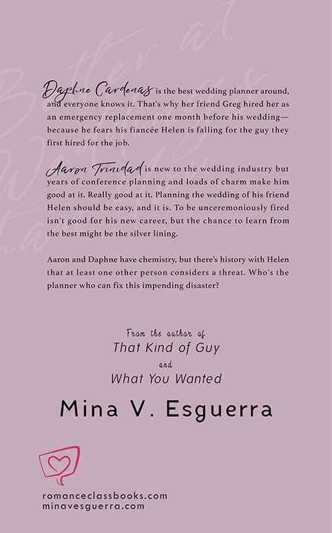
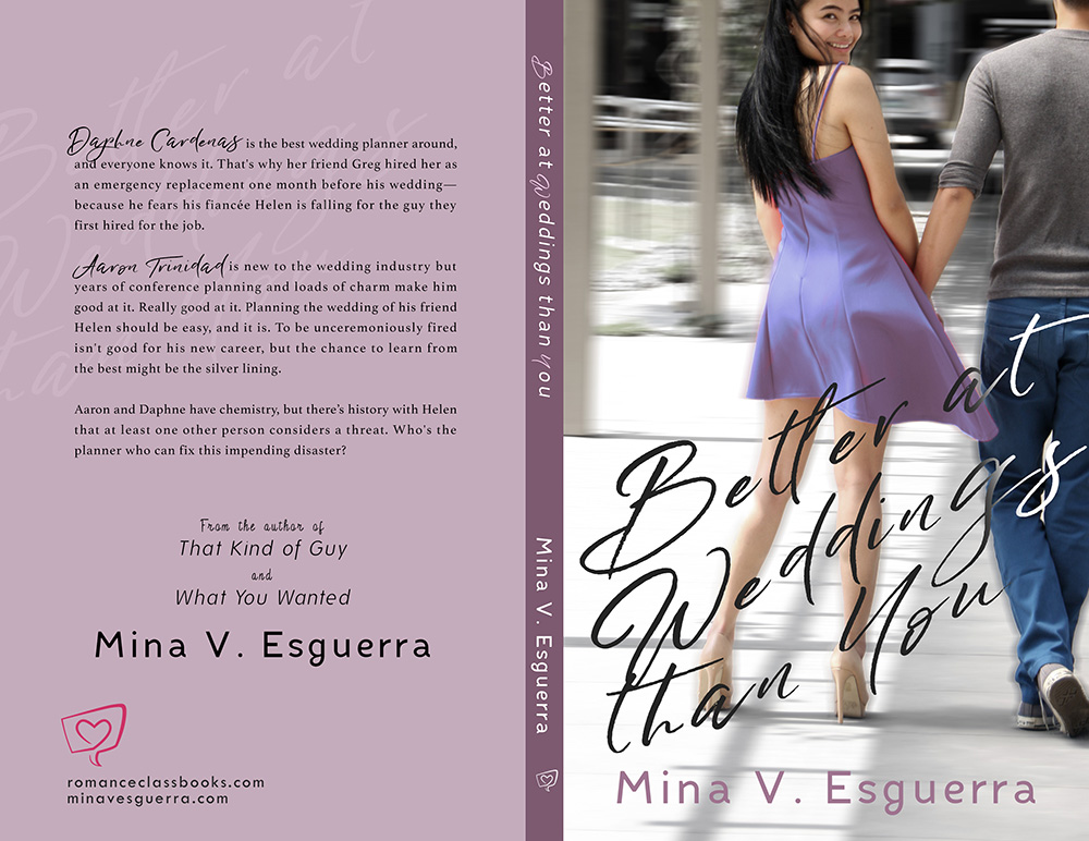
Daphne Cardenas is the best wedding planner around, and everyone knows it. That’s why her friend Greg hired her as an emergency replacement one month before his wedding—because he fears his fiancée Helen is falling for the guy they first hired for the job.
Aaron Trinidad is new to the wedding industry but years of conference planning and loads of charm make him good at it. Really good at it. Planning the wedding of his friend Helen should be easy, and it is. To be unceremoniously fired isn’t good for his new career, but the chance to learn from the best might be the silver lining.
Aaron and Daphne have chemistry, but there’s history with Helen that at least one other person considers a threat. Who’s the planner who can fix this impending disaster?
Work on the cover for Mina V. Esguerra‘s 2017 book Better at Weddings Than You started around March of that year. I had a few options for the cover photos featuring two different couples. Here’s the first batch of design studies I sent Mina:


Design studies is a thing I do with every book cover project. After reading the manuscript, I then put together at least three (maybe more) designs and show them to the author. I try not to spend too much time with each one, leaving the fine-tuning and polishing for the final design the author picks. So cropping may be rough and text may not be aligned properly (see the back blurbs). What’s important is the author sees what you’re trying to do.
I picked these photos because the title is kinda cheeky, and I wanted the focus on the main character (MC) Daphne who needed to look confident as befits her title of “best wedding planner around”. Mina picked this study:
Fun fact: for years, I had always wanted to use this concept for a book cover. What I had in mind was a solitary figure of a woman with her back to the camera. Everything is in black and white, except for the woman’s red dress. However, for BAWTY, instead of turning the background black-and-white, I just desaturated the colors. Then I blurred everything around the couple. I had to — the background was too busy. And I needed to put the focus on Daphne.
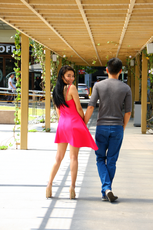
PHOTOGRAPHY: Chi Yu Rodriguez at #RomanceClassCovers
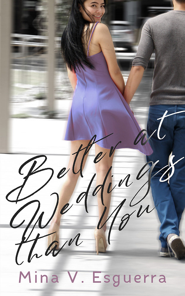
Mina wanted to change the dress color, so I made variations in pink, old rose, purple, fuchsia, and green.


I also made one study with the dress in a sort of lavender/lilac shade, which was what we ended up using for the final design. There was a scene in the book where Daphne wore a blue dress, so blue made sense. But because Aaron’s jeans were already blue, so we settled for lavender. It also kinda went well with the author text color…
… not to mention the back cover of the book.
Okay, not an exact match but … you know. (Shut up, Henry.)
Did I just shamelessly use this discussion about colors to segue into my favorite scene in movie The Man from U.N.C.L.E. ? You betcha.
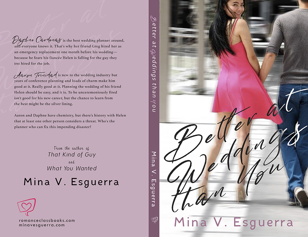
Now on to the back cover. I took the title text and sort of embedded it in the background. That way, there was more space for the blurb and everything else. Mina has written quite a few books already, so I always try to put in a couple of other titles in the back cover. I couldn’t use the title text in that same typeface on the spine because there wasn’t much room, so I just used the same typeface as the author name.
This is the final cover.
This whole thing was prompted because the lovely book blogger/reviewer Nick posted a thread of books as donuts and I—
Yes I love donuts. Almost as much as I love books. Thank you, Nick!
If you like Mina’s Better at Weddings Than You, I hope you enjoyed this blog post! If you’re an indie author who wants to know more about book cover design or an artist who wants to get into book cover design, I hope this gave you some insights. Also, a few of my cover designer friends and I recently did a panel discussion on this very thing, so you might want to check it out.
What are some of your favorite covers of Filipino romance books? Please drop them in a comment below!
Leave a Reply