Latest Posts

How A Book Cover Happens: Better at Weddings Than You

Daphne Cardenas is the best wedding planner around, and everyone knows it. That’s why her friend Greg hired her as an emergency replacement one month before his wedding—because he fears his fiancée Helen is falling for the guy they first hired for the job.

Aaron Trinidad is new to the wedding industry but years of conference planning and loads of charm make him good at it. Really good at it. Planning the wedding of his friend Helen should be easy, and it is. To be unceremoniously fired isn’t good for his new career, but the chance to learn from the best might be the silver lining.

Aaron and Daphne have chemistry, but there’s history with Helen that at least one other person considers a threat. Who’s the planner who can fix this impending disaster?


Work on the cover for Mina V. Esguerra‘s 2017 book Better at Weddings Than You started around March of that year. I had a few options for the cover photos featuring two different couples. Here’s the first batch of design studies I sent Mina:

Design studies is a thing I do with every book cover project. After reading the manuscript, I then put together at least three (maybe more) designs and show them to the author. I try not to spend too much time with each one, leaving the fine-tuning and polishing for the final design the author picks. So cropping may be rough and text may not be aligned properly (see the back blurbs). What’s important is the author sees what you’re trying to do.

I picked these photos because the title is kinda cheeky, and I wanted the focus on the main character (MC) Daphne who needed to look confident as befits her title of “best wedding planner around”. Mina picked this study:

Fun fact: for years, I had always wanted to use this concept for a book cover. What I had in mind was a solitary figure of a woman with her back to the camera. Everything is in black and white, except for the woman’s red dress. However, for BAWTY, instead of turning the background black-and-white, I just desaturated the colors. Then I blurred everything around the couple. I had to — the background was too busy. And I needed to put the focus on Daphne.

Models: Katrice Kierulf and Migs Almendras
PHOTOGRAPHY: Chi Yu Rodriguez at #RomanceClassCovers

Mina wanted to change the dress color, so I made variations in pink, old rose, purple, fuchsia, and green.

I also made one study with the dress in a sort of lavender/lilac shade, which was what we ended up using for the final design. There was a scene in the book where Daphne wore a blue dress, so blue made sense. But because Aaron’s jeans were already blue, so we settled for lavender. It also kinda went well with the author text color…

… not to mention the back cover of the book.

Okay, not an exact match but … you know. (Shut up, Henry.)

via GIPHY

Did I just shamelessly use this discussion about colors to segue into my favorite scene in movie The Man from U.N.C.L.E. ? You betcha.

Now on to the back cover. I took the title text and sort of embedded it in the background. That way, there was more space for the blurb and everything else. Mina has written quite a few books already, so I always try to put in a couple of other titles in the back cover. I couldn’t use the title text in that same typeface on the spine because there wasn’t much room, so I just used the same typeface as the author name.

This is the final cover.

This whole thing was prompted because the lovely book blogger/reviewer Nick posted a thread of books as donuts and I—

Yes I love donuts. Almost as much as I love books. Thank you, Nick!

If you like Mina’s Better at Weddings Than You, I hope you enjoyed this blog post! If you’re an indie author who wants to know more about book cover design or an artist who wants to get into book cover design, I hope this gave you some insights. Also, a few of my cover designer friends and I recently did a panel discussion on this very thing, so you might want to check it out.

What are some of your favorite covers of Filipino romance books? Please drop them in a comment below!

The Lockdown Journal

I have a new podcast!

It’s called The Lockdown Journal. This is where I talk about what it’s like being an indie creator during the current COVID-19 pandemic. The show will be on a limited run — one hopes this pandemic doesn’t last all year — and will have a new episode every Wednesday.

A few people I know have expressed interest in getting into podcasting. As someone who’s been podcasting on and off for ages, I fully support more Filipinos creating podcasts. However, all my podcasts have been self-hosted, which is not really something I can recommend to anyone who isn’t also a web developer (which I am). So I thought I’d produce a limited-run podcast on Anchor to see if it’s a service I can recommend to new podcasters. From what I’ve seen, the UI looks great and easy to use. It has a lot of great features. And it’s free. So far, it has so much going in its favor.

I’m just about to record episode one, but the podcast trailer is already up. Because it takes a while for a new podcast to get approved on the different podcast platforms like Spotify and iTunes/Apple Podcasts, it’s a great idea to first prepare the trailer and launch your podcast with it. That way, you can wait for your podcast to be available in all the places you want it to be before publishing your first episode.

As I’d just launched the podcast, I don’t have any links to Spotify or Apple Podcasts, but I’ll add those here as soon as they’re ready. In the meantime, you can always just head on over to the podcast page on Anchor.fm — https://anchor.fm/thelockdownjournal.

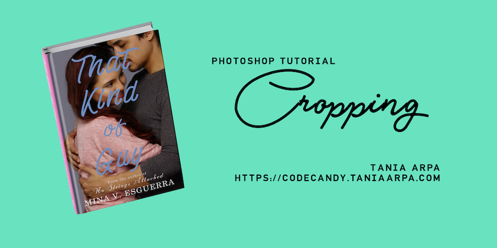
VIDEO: Cropping Tutorial (Photoshop)

It’s been a while, I know! I’m hoping to update this blog more regularly. If there’s a specific kind of design / web dev stuff you want from me, just drop it in the comments below.

So, like so many of us, I’ve been stressed out by recent events. My productivity has gone down so much it’s not even funny. So I decided to do something new instead of just staring at the laptop screen for hours. I turned on QuickTime’s screen recording feature, then did a crop of an image on Photoshop. This was one of the two images I used on the cover of a book I designed a few years ago— That Kind of Guy by Mina V. Esguerra.

The editing wasn’t too complicated so I used iMovie. Then I recorded a voiceover on Adobe Audition, which I also used to master the audio. I put everything together on iMovie, then uploaded it to YouTube.

I actually had to convert the enormous 30+ GB .mov file into a smaller 2.3 GB .mp4 file, and the latter was the video I uploaded to YouTube. I mean, why upload a 30+ GB file when you can upload a 2.3GB one? The quality is pretty much the same I think.

I hope the video tutorial is useful. I’m thinking of doing another video, but this time a demo of how I put together a print book cover. What do you think? Drop your thoughts in the comments below.

A Japanese bookshop in Hong Kong

On a recent trip to Hong Kong, my traveling companions and I found a lovely shop Japanese bookshop. When I say “found”, I mean that we were wandering about and stopped when we saw the sign.

Tomato Books in Hong Kong - shop sign
They had us at “Japanese Books & Magazines”.

As a moderate consumer of Japanese TV shows, Japanese movies and the occasional j-rock band, I felt duty-bound to check it out. I didn’t speak Japanese so I didn’t own any Japanese books (except for a few manga titles in English), but I did collect magazines that featured, uh, boys of important cultural significance.

 
It turns out they had a lot of Japanese language books. And I took a good long while browsing through them because book design in non-English languages was fascinating.

Tomato Books in Hong Kong - shop sign

Look at the covers! I kinda want to design a book in a foreign language someday.

Tomato Books in Hong Kong - shop sign

Of course, book design for the inside pages in a language I don’t understand will be tricky. Someone teach me Japanese, please?

Tomato Books in Hong Kong - shop sign
I’m not even sure if I’m holding this right-side-up.

Japanese characters are so pretty. But then maybe I just think that because I can’t read them.

Tomato Books in Hong Kong - shop sign
This could be the BDSM section for all I know.

Alas, no music magazines featuring OOR.

Tomato Books in Hong Kong - shop sign

The staff at Tomato Books were very pleasant and helpful. When I go back to HK, I’m definitely visiting the shop again.

5 Signs Your Website is Outdated

2005 called, it wants its website design back.

  1. The Website Counter

    These little widgets are so adorably antiquated, they belong in a museum. If you have one on your blog or company website, go and get rid of it now. I mean it. Leave this blog this second and go to your website and get rid of that counter. Come back when you’re done, I’ll wait.

    First of all, people no longer need to know how many times your website has been visited in order to validate their decision to be there. That was a thing a long time ago, when websites were a curious novelty, and only very few people were online checking out what this “internet” or “world wide web” was all about. These days,no one is desperate to know a website’s number of hits; what they want is content. Second, hit counters are easily padded and faked. Third, they tell you, the person who owns the website, absolutely nothing relevant. It doesn’t tell you how many unique visitor you got that day and how many of them were new visitors and how many were returning visitors. It doesn’t tell you what your audience demographic is — are they mostly male or female? What percentage of your audience is the teenage demographic? Middle-age demographic? Are you reaching the audience or market you were aiming for? The website counter won’t give you answers to any of these questions. Get something like Google analytics for that. It’s free, and one of the most useful things you could ever add to your website.

  2. No clear purpose or call to action

    Ten years ago, companies were putting up websites because they felt they should. They were right! But having a website that serves no useful purpose than telling everyone “Hey, look, Company X has a website!” is no longer acceptable these days, with every company and their cat with an online presence, a Twitter account and three Facebook pages. Just like your company, your website should have a real reason for existing. It should move people to do your bidding action, make them buy your products, sign up for special offers, read more of your great content.

  3. No integration with your social media accounts or social media sharing tools

    Everything is social now — apps, websites, cats. If you have a Pinterest page or a Twitter account and they’re not visibly promoted on your website, you’re losing a great opportunity to connect with your customers. Think about it. Everyone buys stuff. Stuff a person buys is made by hundreds of different companies. That person can’t possibly remember to visit the website of each of these companies. Your customer won’t remember to drop by your awesome knitting supply webstore unless you remind them to. That means convincing them to follow you on Twitter, Facebook, Instagram. Where they will see your post about the new cat sweater knitting patterns which — guess what — they can buy on your website, and oh look, here’s the link. It’s also great if you could add handy buttons which will let your website visitor share your articles and pages to their own social media accounts.

  4. It looks awful or unreadable or takes too long to load on a mobile phone

    More than 50% of website visits are done through a mobile device. That means, on average, how your website looks on a mobile phone or a tablet is how most of your visitors see your website. Most websites, unless optimized for mobile devices, will not look good on a small screen. The text will be too small to read, and the overall user experience will not be ideal. While load time on a desktop or laptop computer will be fine, a non-mobile-optimized website will take too long to load on a smartphone. All these problems will make you lose potential customers. There are two solutions to this: (1) make a mobile-friendly version of your site kick in if it’s viewed on a mobile device, and (2) use a responsive design for your website. However, I strongly believe responsive website design is currently the best means of making your site usable for your viewers.

  5. It’s not search engine-optimized

    When people look for stuff online, almost half the time they begin by doing a search on a search engine, such as Google. You want search engines and their crawlerbots (the programs that go through the internet compiling website and webpage addresses) to think you’re awesome so they’ll put you high up on the list of search results for words that are relevant to your website (“keywords”). For example, if you do a Google search for “kittens of the apocalypse”, you’ll get a bunch of articles and podcasts with titles that are various permutations of the phrase “kittens of the apocalypse”. So if your website is about “kittens” and the “apocalypse”, you’ll want your website optimized to appear on that Google search result. A great many factors affect how high up that list your website will be found, but one of them is your website’s search engine optimization, a.k.a. “SEO”, a.k.a. “How much does Google like you?”

    Trust me, you want Google to like you. If Google likes you, it will put you on the first page of search results (of the keyword relevant to your business or website of course). If Google really, really likes you, it will put your website on the very top of that page. You want to be on top of that page, because it means that people looking to buy kitten sweater knitting patterns or adamantium shuriken will easily find your website selling kitten sweater knitting patterns or indestructible sharp throwing things, respectively. More people finding you on Google means more visitors to the party. (By “the party” I mean “your website”. Unless your website is about a party you want to invite people to, in which case I mean “both”.)

    I’ll be blogging about SEO here soon, but in the meantime, check out Google’s SEO Starter Guide.

A business website is like your Facebook profile photo — you don’t want it to make you look old. And unlike getting plastic surgery for yourself, no one will judge you for giving your website a facelift. I generally think people ought to do whatever they want to their faces so long as they hire professionals who know what they’re doing. Come to think of it, I feel the same way about websites. I totally judge badly-built websites, and if you’ve read that SEO starter guide, you know Google will too.

Where I write a ridiculously long post explaining why your company or blog needs a Mailing List

Everyone has email. Well, everyone who’s online or who uses a smartphone, at least. You need it to sign up for social media sites like Facebook, Twitter and Instagram. If the Internet were a human body, email would be its veins and arteries.

This is why mailing lists continue to be an effective marketing tool for companies and websites. Yes, marketing on social media sites are quite popular (and I recommend you do that too), your reach is entirely dependent on their terms. For instance, Facebook alone decides whether or not a person sees your company page updates on their feed. So even if you have tens of thousands of likes on your page, only a fraction of them will actually see your posts. It didn’t use to be that way, but when Facebook decided that was how they were going to do things, there was nothing their users could do about it. And what happens when a social media site goes out of business? Remember Friendster?

And let’s not forget, even the most popular social media sites like Facebook and Twitter rely on mailing list updates to keep their users coming back to their sites. (You know those emails Facebook and Twitter keep sending you? Yeah, I’m talking about that.)

DM from @stephenfry

When you sign up, Twitter may email you notifications. For example, here’s one for a DM I got. (Yes, I had to brag.)

What is a mailing list?

Simply put, a mailing list is a list of subscribers’ email addresses. Whenever you want to promote a product, service, event or news, you simply write a nice email and send it off to all those email addresses. I say “subscribers” and not “random people whose email addresses you picked up from various sites online” because it means they signed up to receive emails from you or your company. They know they will be getting emails from you on specific topics. This is what separates your mailing list emails from spam.

Your Tools

While you can definitely run your mailing list off your email account, I recommend that you use a mailing list service. For a good many reasons:

  • It will provide pages and forms that make it easy for your customers (or blog readers) to subscribe and unsubscribe to the list.

    A Mailchimp sign-up form.

    A Mailchimp sign-up form. (from bronzeage.ph)

  • It makes it easier for you to manage your mailing list when it’s grown to more than twenty subscribers.
  • Most mailing list services have ready-to-use templates so even if you have zero layout/design skills, you can send still send out your emails in style.
  • Most services have analytics — a way of tracking user statistics, like how many of your subscribers actually read your emails and how many click on the links in those emails. You can use them to test how effective your emails are.

My go-to mailing list service is MailChimp, which gives you access to basic features for free, but there are others out there, and a lot of them are free. For instance, you can set up a group on Yahoo Groups as a mailing list — make it so only you are able to email the group. If your blog runs on WordPress, the Jetpack plugin has a Subscription feature which lets your readers subscribe to get updates on new content on your site.

What else do you need? Well, it helps to have a great intro to or spiel for your invitation to subscribe. This must include

  • a clear idea of what subscribers are signing up for, whether it be updates on new products, notification of new content, a free product, or whatever it is you are offering via email. Be sure to stay within the boundaries of what you’re offering. This means you don’t say your mailing list is for blog updates, and then send your subscribers an email selling them a house.
  • the declaration that you won’t sell or give away subscribers’ information. This is a promise you must definitely uphold. No one wants spam, and when someone gives their email address to a company or website, they want to know that it won’t end up in a spammer’s list.

How to get people to sign up

Of course, some people may need to be convinced to sign up to your mailing list. If your great product or awesome blog content isn’t enough you could offer something else:

  • A free product, one related to your company’s product or your website’s topic. A popular freebie used by blogs is ebooks, usually written by the same person writing for the blog. For example, if you run a cooking blog, you could put together a bunch of your unpublished recipes in a PDF file and offer that to your subscribers. You could also offer a physical prize, and give subscribers a chance to win it.

    An example of a website inviting its reader to sign up for the mailing list and getting a freebie in return.

    An example of a website inviting its reader to sign up for the mailing list and getting a freebie in return. (from Get Real About Business)

  • First peek at an offering. If you are about to release a new product, offer your subscribers the opportunity to get an advance look at this product. Book authors can give their mailing list subscribers the first three or five chapters free.
  • Invitation to a party or a web seminar or a live video chat. The party could be an event you’ve already set up. With free services like Google Hangouts and Skype, web seminar and live video chat are activities that may not cost you anything at all, except for an hour of your time. And they will give you a chance to connect to your customers or readers.

Rock your mailing list

It’s important to remember that while the offer of free stuff will get people to sign up to your mailing list, great content is what will keep them on that list, eagerly awaiting new updates.

  • Stay relevant. Don’t do a bait-and-switch by promising updates on a certain topic and then sending them emails on unrelated topics.
  • Don’t try to sell your subscriber products that have nothing to do with what they signed up for.
  • Be topical! Is Valentine’s Day coming up in a couple of weeks? If you have a romance or v-day-related product, service or blog post, why tell your subscribers about it? Mark out special days/seasons in the calendar and plan your updates around them: Christmas, summer, first day of school, Women’s Month, etc.

You can run a mailing list without spending a cent, but it could be the one thing that enables you to market your products or your blog effectively. Take advantage of the wealth of free resources online, learn as you go, and grow your captive audience. Why not start today?

Book Design: Playing Autumn by Mina V. Esguerra

I‘ve actually done a cover for this story before. It was for the original, novella-length version of Playing Autumn, which was included in a limited-run romance anthology, and published as a limited-run print edition.

Playing Autumn novella

The new version is a novel — it’s longer and the romance is a bit steamier. So Mina asked me to do another cover that was — in her words — “spicier”. Read More

Web design: Responsive design for websites — is it for you?

What does your website look like on a phone?

Too many websites these days (including a couple of mine!) are stuck in the days before mobile devices became a thing. And by “became a thing”, I mean it became a popular choice of machine to view websites on.

When mobile devices growing in popularity, it used to be that websites adapted by having a separate design for mobile devices — it kicked in when the site detected that it was being viewed on a phone or a tablet. Others had mobile versions of the site — probably not a different set of files, but the URL of each page of the mobile version was different from that of the desktop version. Basically, the page redirects to the mobile version when it detects a non-desktop browser. Which has always annoyed me, because these sites don’t seem to work both ways. Often, when you view a mobile page while you’re on your computer, the page doesn’t redirect automatically to the desktop version. And while some of these web pages do have a button or link that goes to the desktop version, it’s to the desktop version of the homepage and not the desktop version of that particular page.

Jetpack, one of my favorite WordPress plugins, has a feature that, when turned on, automatically gives your website a mobile version. Which is nice and all, but the mobile site you get is generic and stripped of all the colors and fonts that make your desktop site pretty. Furthermore, the homepage displays only your recent posts. This is fine if your website is a blog or a news site, but what if you don’t actually have any posts? What if all your content is in pages? That means nothing shows up on the front page, and the viewer has to click on the drop-down menu to see what pages are available to view.

This is why responsive design for websites is so cool. It basically removes the divide between mobile and desktop: your website when viewed on a laptop is the same website when viewed on your phone, only they look slightly different.

For example, here’s my website (not this one, the other one) as viewed on my Macbook browser:

TaniaArpa.com on the Macbook (responsive design)

This is how it looks like on my phone

TaniaArpa.com on mobile (responsive design)

See? That’s the exact same website, viewed on different machines. The circle buttons are laid out horizontally on the desktop version, and vertically on mobile.

The menu is also displayed differently. Here’s how it looks on a desktop browser (I use Chrome, by the way):

TaniaArpa.com on the Macbook (responsive design)

On mobile, the menu becomes drop-down:

TaniaArpa.com on mobile (responsive design) TaniaArpa.com on mobile (responsive design)


Nifty, right? The theme is Minimable by Fedeweb.

(And in case you’re wondering, this blog is also using responsive design. If you’re viewing this on your computer, try checking it out on mobile. And vice versa.)

“Design is not just what it looks like and feels like. Design is how it works.”
—Steve Jobs

Having a responsive design saves you having to make separate desktop and mobile designs for your website. And there’s only one URL for each page, no matter where you view it — this matters because when someone clicks on a link to your site that’s been shared on, say, Twitter, and they’re on a computer, they will see your website in its full widescreen glory, even if the person who shared that link did so on a mobile device. And most important of all, your website will not drive me nuts.

You can find wonderful responsive WordPress templates online — and lots of them are free. Now if you’ll excuse me, I need to take my own advice and go and change some of my websites’ themes.